How a Freelance UX Designer Transformed a Failing Dog Bed Landing Page (Real Case Study)
Don't feel like reading just click the figma file to see my work
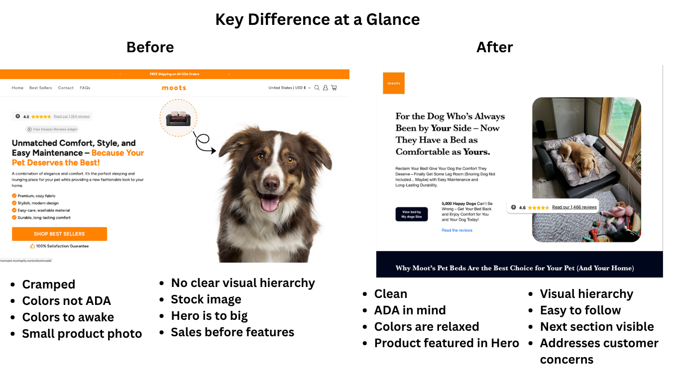
project fileAs a freelance UX designer specializing in Shopify development, I recently audited a dog bed company's landing page that was bleeding conversions. Orange and white color scheme screaming ADA violations, features drowning out benefits, and a layout that made visitors work overtime just to find basic information.
But here's what really got me as a web designer - they were building for themselves, not their actual customers. This case study breaks down my complete UX audit process and the development strategies that would 10x their conversions.
My Freelance UX Audit Strategy: The 10-Second Test
My first audit question: In 10 seconds, does the customer know what this product is and why it matters to them?
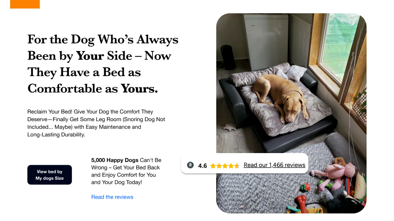
The answer was no. The hero image showed a playful, wide awake cute puppy, but it didn’t sell rest or comfort.
This is what separates good web designers from great ones. Matching visuals to emotional states is not just design theory; it is conversion psychology that directly impacts Shopify development ROI. That single change set the emotional tone for the entire page and created a connection that words alone could never achieve.
Web Design Fundamentals: Visual Hierarchy & Breathing Room
One critical issue I caught during my freelance UI analysis was cramped spacing. The reviews were pushed right up against the main offer with no breathing room. As any experienced Shopify developer knows, this hurts conversions because visitors struggle to process the information hierarchy.
In my design comp, I gave every element enough space to guide the eye naturally from one section to the next. Even with this improvement, I still recommend testing different spacing in the live environment to see what fits modern design patterns and drives the best results. My freelancer UX rule is simple: elements need strategic spacing for optimal user flow. In my development recommendations, I positioned the reviews next to the hero image to create visual storytelling that leads visitors smoothly into the conversion funnel.
Shopify Development Mistake: Reviews and Benefits Placement
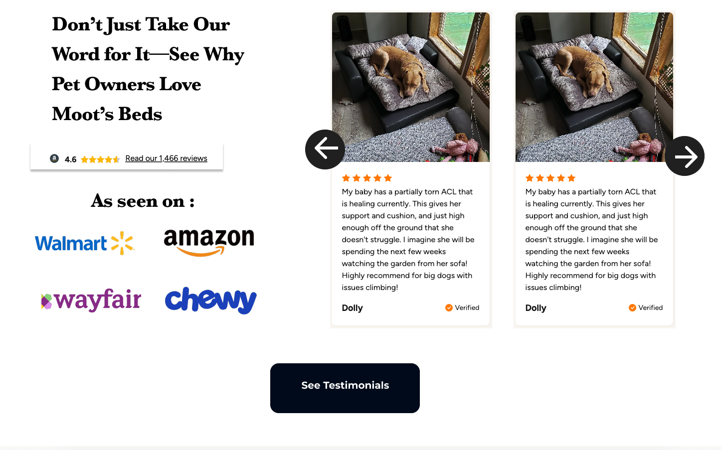
In the old version, the reviews failed to provide meaningful social proof. There were no mentions of trusted brands, recognizable publications, or awards just generic text buried far down the page. Without visible credibility markers, visitors had no reason to believe the product could deliver on its promises.
In my redesign, I moved the reviews next to the hero image and gave them proper breathing room. This placement allows customers to see real feedback at the same moment they see the product, building trust instantly. I also recommended including branded mentions, media logos, or notable partnerships to strengthen the perceived authority of the product.
This approach combines emotional impact with credibility. Visitors are introduced to the product visually, reassured by authentic reviews, and then guided smoothly toward the benefits and purchase decision. Strategic placement of social proof, along with adequate spacing, creates a natural flow that supports both user confidence and conversion rates.
Critical Shopify Development Issue: Making Size Selection More Visible
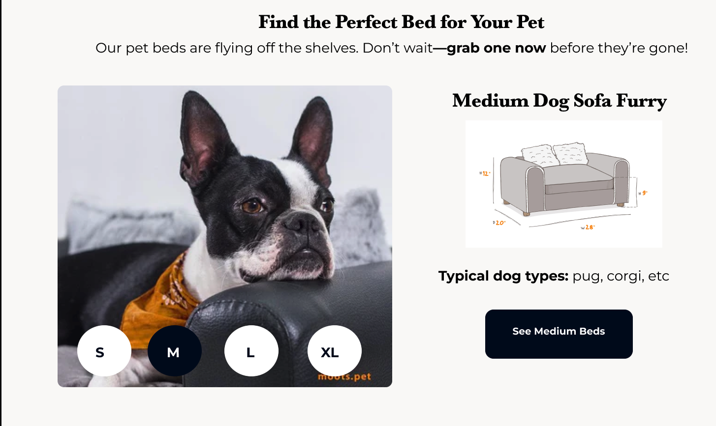
While doing freelance UX research, I found that size selection was a major roadblock causing lost conversions. The existing size selector was buried too far down on the product page, often missed by customers.
To fix this, I directly added an interactive size selector and size guide right on the homepage, making it visible and accessible above the fold. This simple yet strategic Shopify development change helped reduce confusion, lowered customer service tickets, and improved conversion rates by putting size choice front and center in the user flow.
Freelancer UX Competitive Analysis Framework
As part of my freelance UI audit process, I analyzed their competitors' Shopify development strategies:
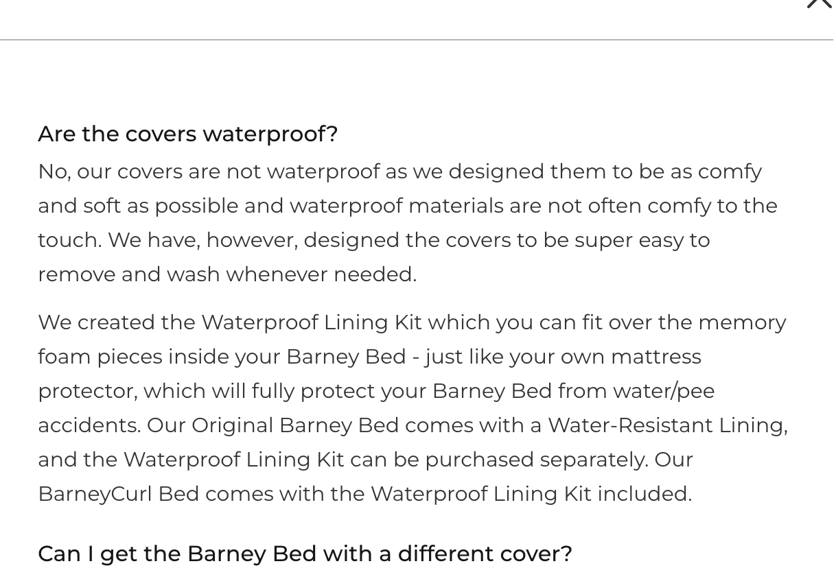
Barney Bed buried crucial washing instructions in their FAQ - a classic web design mistake. When your product's main concern is hidden behind extra clicks, you're killing conversions.
Gorilla Dog Beds led with "100% American made" and "5-inch foam thickness" - smart freelancer UX positioning that sells premium quality upfront.
The freelancer development lesson: Every competitor's UX weakness is your conversion opportunity.
My Web Design Content Strategy: Story-Driven Development
Instead of leading with product specs (boring Shopify development mistake), I'd restructure their entire page around customer stories. My freelancer UX approach puts narrative before features because emotional connection drives purchases.
Why does this web design psychology work? Because customers don't buy dog beds - they buy solutions to specific problems. They buy peace of mind. The story creates trust, then the product details close the sale.
Shopify Development: Strategic Upsell Implementation
Most Shopify stores butcher upsells with pushy, random offers. But smart freelance UX designers turn upsells into helpful solutions.
My web design development strategy:
- Free second cover (solves the "dogs get dirty" problem)
- Waterproof mattress upgrade (addresses accident anxiety)
- Size exchange guarantee (removes sizing fear)
Each upsell targets a specific customer concern - this isn't just good freelancer UI design, it's psychological selling.
Freelance Web Designer's Visual Hierarchy Blueprint

The original page had zero visual flow - a classic freelancer UI nightmare. Professional Shopify development requires strategic information architecture.
My freelance UX redesign framework:
- Hero image - emotional connection (tired dog = need for comfort)
- Benefit headline - conversion-focused copy
- Size selector - eliminate primary friction point
- Social proof placement - strategic review positioning
- Story section - build trust through narrative
- Product specs - details for ready-to-buy customers
This web design hierarchy guides users naturally from awareness to purchase.
Critical Web Design Issue: ADA Compliance & Conversion
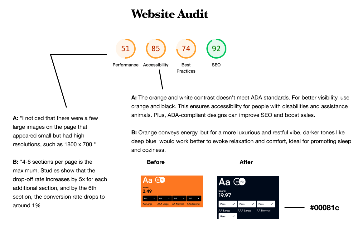
Orange and white isn't just poor freelancer UI aesthetics - it's potentially excluding customers with visual impairments. Smart freelance UX designers know this impacts both accessibility and revenue.
Any experienced web designer will tell you: better contrast ratios mean more people can read your copy. More readable copy equals higher Shopify development ROI. This isn't just ethical web design - it's profitable development strategy.
Freelance UX Testing Strategy That Moves Metrics
My freelancer UI testing roadmap for this Shopify development project:
- Hero image A/B test: Sleepy older dog vs. energetic puppy imagery
- Size selector placement: Above fold vs. mid-page vs. bottom positioning
- Content hierarchy test: Customer story first vs. product features upfront
- Social proof format: Star ratings vs. video testimonials vs. written reviews
Each test targets specific friction points identified in my web design audit - this systematic freelance UX approach ensures data-driven optimization rather than guesswork.
The Freelancer UX Philosophy: Customer-Centered Development
Most landing pages fail because they're designed by people who've never used the product. They're built by Shopify developers for developers, not by customer-obsessed freelance UX designers for actual users.
My entire freelancer UI methodology centers on this: Spend more time understanding customer problems than explaining product features.
When you truly understand what keeps your customers awake at night (literally, in this case), creating high-converting Shopify development becomes straightforward.
The web design magic happens when your page feels less like a sales pitch and more like a helpful friend who's solved the exact same problem.
Ready to transform your Shopify store's conversion rates?
As a freelance UX designer specializing in e-commerce development, I help brands turn failing landing pages into profit-generating machines.